AUTOMATED DATA PROCESSING AND VISUALIZATION
Escape from Excel!
Visualize your data
Excel sheets are one of the most prevalent means of reporting across all types of organizations, often referred to as “Management by Excel.” Many organizations have amassed large collections of Excel sheets for management reporting purposes, which makes it very difficult during a merger or an acquisition to find ways to report and predict on the new combined entity with Excel.
Here are the main issues with “Mangement by Excel”:
- Over a multi-year time span the reports change, as do the underlying assumptions, and data.
- It is difficult to visualize what all this data is telling you from an individual excel sheet, or worse thousands of them.
- The person who originally designed these reports or the raw data may no longer be available.
REAL WORLD EXAMPLE
To give a real world example of this situation we will look at the FBI: Crime in the US reports Uniform Crime Reporting (UCR) from 2008 to 2015. As descibed on their web page:
An annual publication for more than eight decades, this report contains a compilation of the volume and rate of violent and property crime offenses for the nation and by state. Individual law enforcement agency data are also provided for those contributors supplying 12 months complete offense data. In addition, this report also includes arrest, clearance, trends, and law enforcement employee data. Also available to use with Crime in the United States is the online UCR Data Tool to research crime statistics for the nation, by state, and by individual law enforcement agency.
FBI CRIME IN THE US DATA FILES
The crime data collection is rolled-up at the national level with reporting from local, state, and tribal law enforcement agencies. Each year contains a large number of files. For example in 2015 alone there were 512 Excel sheets, 101 Data Declarations, 31 Reports, 9 figure files.
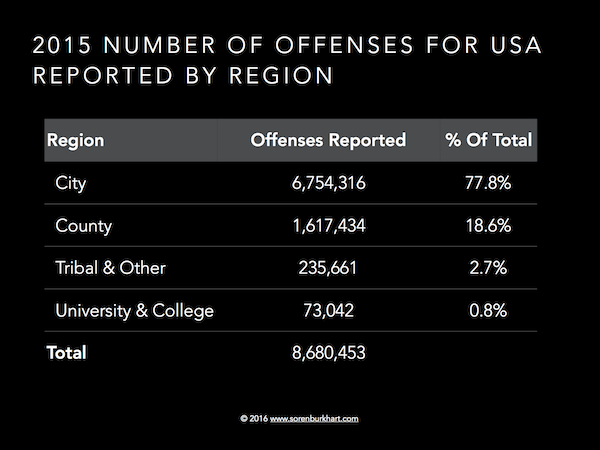
As seen in Figure: 2015 NUMBER OF OFFENSES FOR USA REPORTED BY REGION, In 2015 City and County level offenses represented 96.4% of all reported offenses.
Using the city (Table 8) and county (Table 10) level data from the FBI: Crime in the US from 2008 to 2015 will require processing 43 MB of data in 769 individual Excel reports.
DATA PROCESSING CHALLENGES
These Excel reports were designed to be easy for a human to read, but results in the following challenges for data process automation:
- No mapping of cities to respective counties in the city data file
- Footnotes by state, city, crime need to be found and indexed to each data element
- The data stored on each row isn’t consistently formatted over the years, and the numbr of columns change.
- Three states do not provide county level data: Connecticut, Massachusetts, Rhode Island.
- Alaska and District of Columbia have no counties.
AUTOMATED INTELLIGENT AGENT
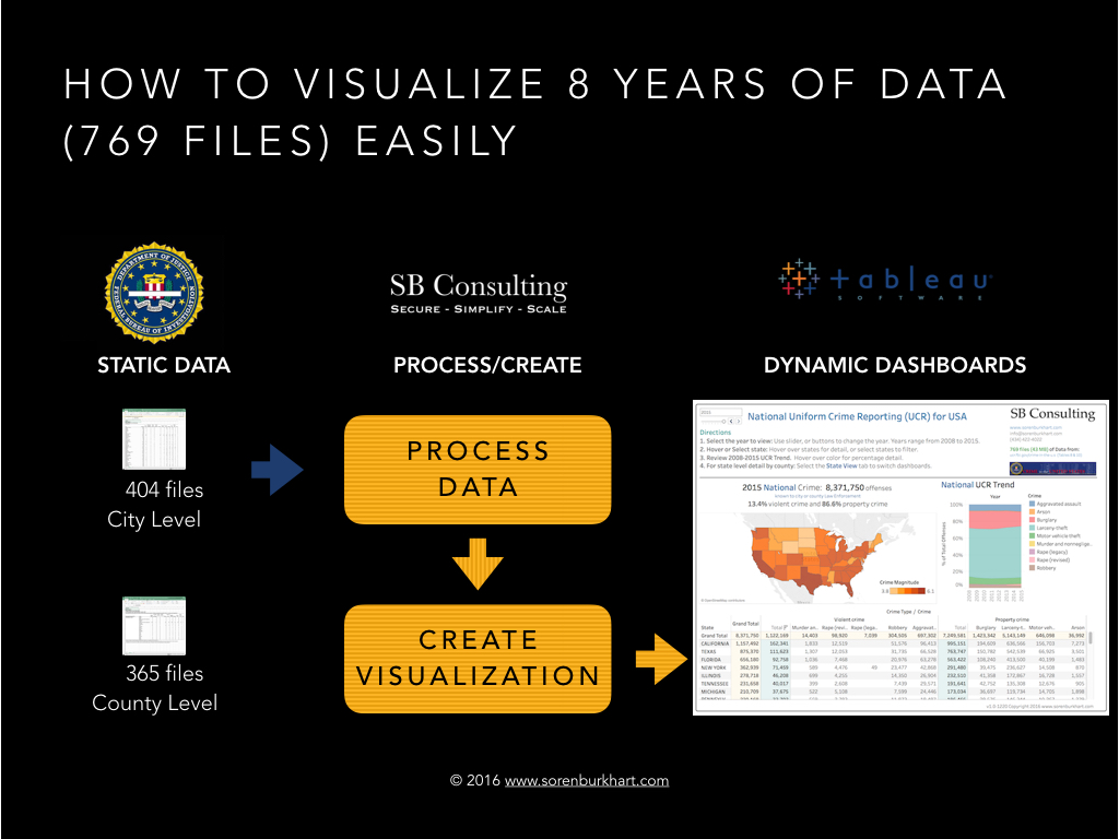
In order to overcome these challenges an automated intelligent agent was created to process the files, and handle any exception handling. Then a visualization is created to handle the data and provide an interactive means of looking at the data at both a national and state level. This process can be seen in Figure: HOW TO VISUALIZE 8 YEARS OF DATA (769 FILES) EASILY.
Once the automated intellgient agent was created the processing time for the automated intelligent agent to process all 769 files to feed into the visualization was less than 5 minutes.
BUILDING THE VISUALIZATION
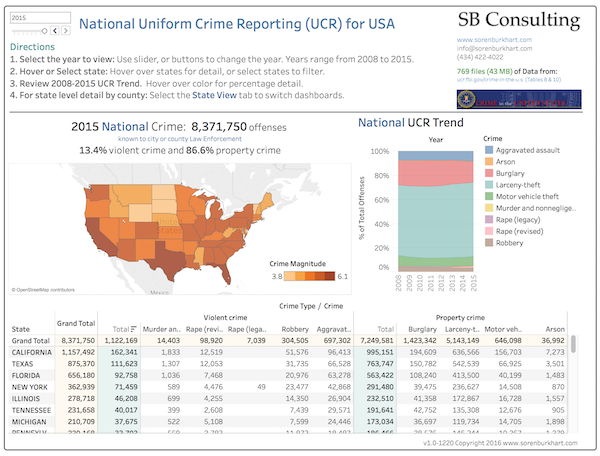
One challenge in building the visualization was to determine how to best represent the crime magnitude across different states or counties in a meaningful way. Given that offenses could range in very small values <10 to very large numbers >100,000, the crime magnitude was defined as the log of the number of offenses. In other words it counts the powers of ten in the number of offenses to create a range.
For example:
- 10 offenses would be log(10) = 1
- 100,000 offenses would be log(100,000) = 5
This provides a nice range of values to change the color of orange which represents crime magnitude. Darker shades of orange represent higher crime areas, and lighter shades represent lower crime areas.
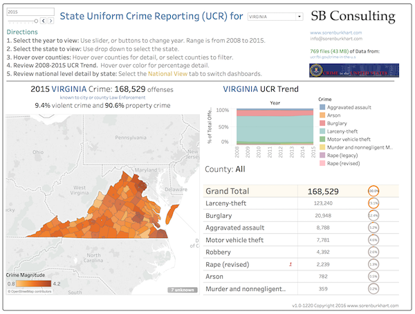
In order to simplify the user interface two dashboards were created. As seen in Figure: National Uniform Crime Reporting which shows crime by State in the USA, and then on a separate tab as show in Figure: State View Uniform Crime Reporting dashboard which focuses on a particular state to show the county level information.
While your organization may not be fighting crime on a daily basis, it is very likely that your organization is fighting an ever increasing tide of Excel reports.
Click here, or on the images to the right to interact with the data analysis and visualization and see how easy it is to escape “Management by Excel!”

